UK Domestic Airport Traffic: A Shiny Investigation
I’ve been looking for an excuse to create a Shiny app, an R based web application, and decided to start with a data set I stumbled upon at work on UK Airport Statistics. The data shows directed passenger traffic between domestic airports over 12 months, and goes back to 1990 (with some unexplained missing data from 1997 to 2000). You can also get data for each individual month, but to begin with I decided to focus on yearly aggregated data.
Click on the image below to view the interactive demo. If it doesn’t appear to be working, it may have maxed out the usage limits on the free tier of ShinyApps.io; leave a comment below and I’ll try and fix it as soon as I can!
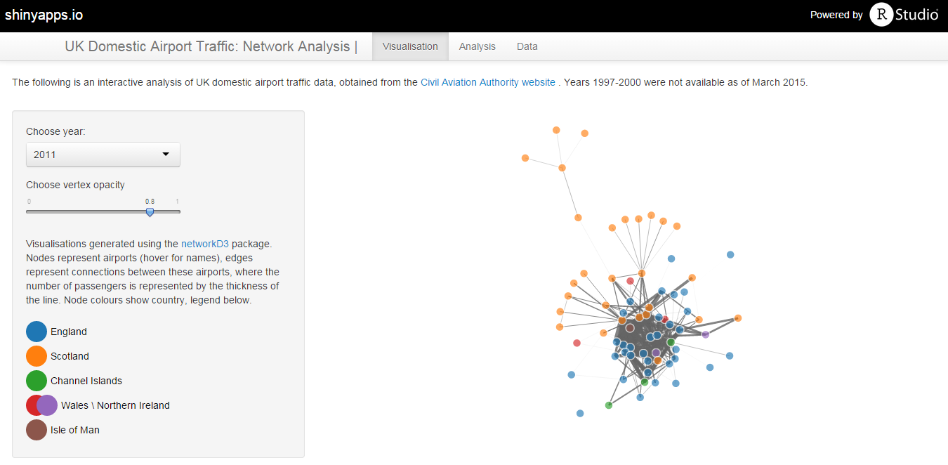
There are 3 tabs along the top linking to three different views of the data. The first is a network visualisation for each year, built with d3Network. Here, nodes represent airports, coloured by country, and edges show the aggregated two-way traffic between those airports. The network is arranged using a force directed network, an algorithm akin to simulating charged particles and springs as the nodes and edges respectively in such a way that strong and weak relationships can be seen spatially (wikipedia provides a thorough review of this technique). In other words, two airports with lots of traffic between them appear closer than those with less or no traffic.
A first look at the data from 2013 shows some obvious patterns; the major London hub airports are clustered around the center, alongside other capital city airports such as Cardiff and Edinburgh. Scottish islands and private airports populate the outer edges of the network, due to their infrequent or limited connections with other major airports. As you look back in time there is noticeably less elongated branching, suggesting that smaller airports were not as isolated as they are today.
The second tab shows some simple graph metrics plotted over time. A significant pattern that emereges from this view is the increase in connections and average path length during 2012. I assume that this was a result of the London Olympics that summer, leading to new routes being opened between domestic airports. Diameter, which is a measure of the maximum number of steps between any two nodes in the graph, also increased; this is often read as a measure of a graph’s overall connectivity, which suggests that whilst new routes may have opened, the isolation of peripheral airports from the rest of the graph actually increased.
The final tab provides a look at the raw data used to generate the networks and the plots. Shiny reads and renders all this data live, which makes the speed and flexibility pretty impressive. It makes exploration of the data simple, so go ahead and explore, and comment if you find anything interesting.
All the code used to clean the data and generate the app is on GitHub.
Enjoy Reading This Article?
Here are some more articles you might like to read next: