Cosmological hydrodynamic simulations have, in recent years, become capable of matching key distribution functions in the local universe, such as those of stellar mass and star formation rate. However, high resolution, large volume simulations have rarely been tested in the high redshift (z > 5) regime, particularly in the most overdense environments. Creating models that fit both high redshift and low redshift observables self consistently is a significant challenge, but key to understanding the properties of galaxies in the first billion years of the universe’s history, and how this affects their latter evolution. Such models are also necessary to make detailed predictions, and plan observations, for upcoming space based instruments, such as JWST, WFIRST and Euclid.
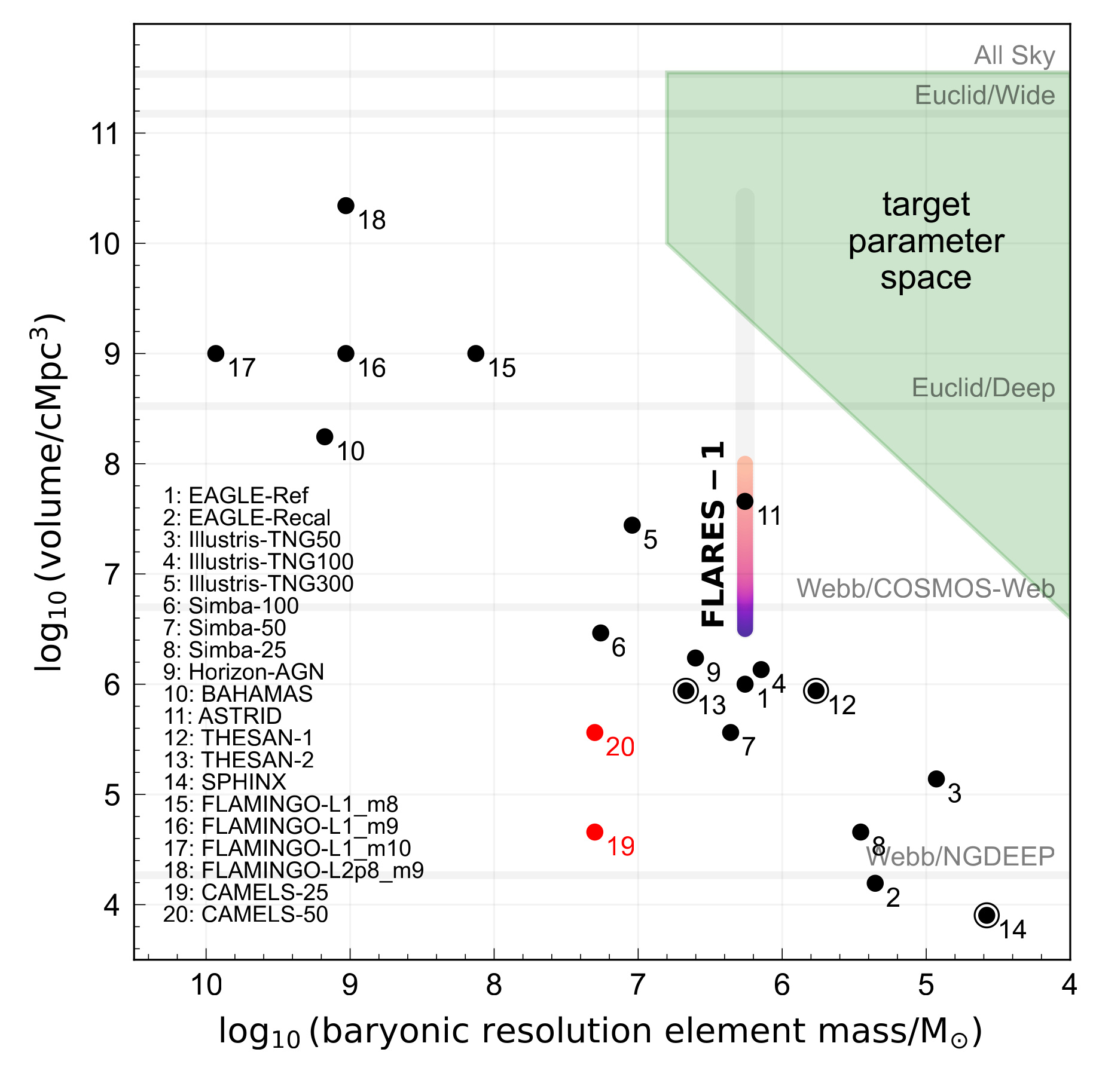
Figure of merit showing the general anti-correlation between simulation resolution and volume probed. FLARES is able to break this correlation, and explore much larger effective volumes at high fidelity.
The First Light And Reionisation Epoch Simulations (FLARES) are one approach to these issues. FLARES consists of a suite of 40 ‘zoom’ simulations using a modified version of the EAGLE code. We selected regions at high redshift, with a range of overdensities, from an enormous periodic dark matter-only volume, and resimulated these with full hydrodynamics at fiducial EAGLE resolution.
I led the first release paper (Lovell et al., 2021) in which we study predictions for the galaxy stellar mass function, star formation rate function and star-forming sequence as a function of environment. I also led a paper studying passive galaxy populations in the high redshift (z > 5) regime (Lovell et al., 2023). Further work with the FLARES suite is described in (missing reference)
References
2023
-
First light and reionisation epoch simulations (FLARES) - VIII. The emergence of passive galaxies at z ≥ 5
Christopher C. Lovell, Will Roper, Aswin P. Vijayan, and 9 more authors
MNRAS, Nov 2023
ADS Bibcode: 2023MNRAS.525.5520L
Passive galaxies are ubiquitous in the local universe, and various physical channels have been proposed that lead to this passivity. To date, robust passive galaxy candidates have been detected up to z ≤ 5, but it is still unknown if they exist at higher redshifts, what their relative abundances are, and what causes them to stop forming stars. We present predictions from the first light and reionisation epoch simulations (FLARES), a series of zoom simulations of a range of overdensities using the EAGLE code. Passive galaxies occur naturally in the EAGLE model at high redshift, and are in good agreement with number density estimates from Hubble Space Telescope (HST) and early JWST results at 3 ≤ z ≤ 5. Due to the unique FLARES approach, we extend these predictions to higher redshifts, finding passive galaxy populations up to z ~ 8. Feedback from supermassive black holes is the main driver of passivity, leading to reduced gas fractions and star forming gas reservoirs. We find that passive galaxies at z ≥ 5 are not identified in the typical UVJ selection space due to their still relatively young stellar populations, and present new rest-frame selection regions. We also produce mock NIRCam and MIRI fluxes, and find that significant numbers of passive galaxies at z ≥ 5 should be detectable in upcoming wide surveys with JWST. Finally, we present JWST colour distributions, with new selection regions in the observer-frame for identifying these early passive populations.
2021
-
First Light And Reionization Epoch Simulations (FLARES) - I. Environmental dependence of high-redshift galaxy evolution
Christopher C. Lovell, Aswin P. Vijayan, Peter A. Thomas, and 4 more authors
MNRAS, Jan 2021
We introduce the First Light And Reionisation Epoch Simulations (FLARES), a suite of zoom simulations using the EAGLE model. We resimulate a range of overdensities during the Epoch of Reionization (EoR) in order to build composite distribution functions, as well as explore the environmental dependence of galaxy formation and evolution during this critical period of galaxy assembly. The regions are selected from a large \(3.2 }, }mathrm{cGpc})^{3} parent volume, based on their overdensity within a sphere of radius 14 h-1 cMpc. We then resimulate with full hydrodynamics, and employ a novel weighting scheme that allows the construction of composite distribution functions that are representative of the full parent volume. This significantly extends the dynamic range compared to smaller volume periodic simulations. We present an analysis of the galaxy stellar mass function (GSMF), the star formation rate distribution function (SFRF), and the star-forming sequence (SFS) predicted by FLARES, and compare to a number of observational and model constraints. We also analyse the environmental dependence over an unprecedented range of overdensity. Both the GSMF and the SFRF exhibit a clear double-Schechter form, up to the highest redshifts (z = 10). We also find no environmental dependence of the SFS normalization. The increased dynamic range probed by FLARES will allow us to make predictions for a number of large area surveys that will probe the EoR in coming years, carried out on new observatories such as Roman and Euclid.
