MPS Hack Day
I was reminded by this news article of a Hack day I took part in way back before Christmas at Sussex Uni. The event brought together undergraduate and graduate students from maths and physics for a day of data and tech hacking. There were two projects, the first involving something more data driven with medical data, and the second looking at visualising astronomical data for outreach purposes. I ended up on the second team, and started by writing a short R script to convert the astronomical data from FITS format in to something a little more palatable. I thought I’d try my hand at some plotting since I already had the data in R, and managed to generate some very rough 3D visualisations before I had to leave mid-afternoon. Despite not being anywhere near the envisioned final product, I think I impressed a few colleagues with what can be achieved in R with only a few lines of code, doing all the data munging plus visualisation inside RStudio.
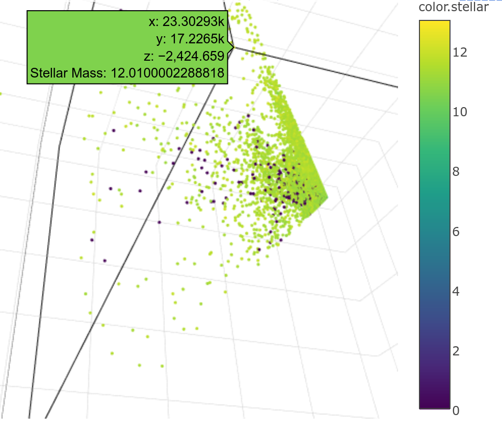
Below are some snapshots of the interactive plots. Unfortunately Plotly doesn’t let you embed unless you pay for it, and SGL isn’t embeddable in the browser. Plotly has a non-premium limit of 50000 points in its interactive plot, but the SGL plot shows all the data points.
The data is taken from the XMM cluster survey. The cone shape is due to the point of view of the survey; the telescope is looking from the vertex of the cone. The density of points is greater nearer the vertex since these objects are closer, and therefore easier to observe.
At the bottom is a gist demonstrating some of the libraries and functions used (I can’t make the data available as it’s a few gigabytes in size, but you should be able to find similar data sets on the ESA website).
Another hack day has been organised for March, where we’re hoping to explore the possibilities of VR as an outreach tool.
Subscribe via RSS


